How to use NLP
This article explains how to navigate NLP functionality, including how to view trends in sentiment and how to view keywords.
The NLP functionality uses as its data source the text based responses provided by someone who completes an open-ended question in any survey.
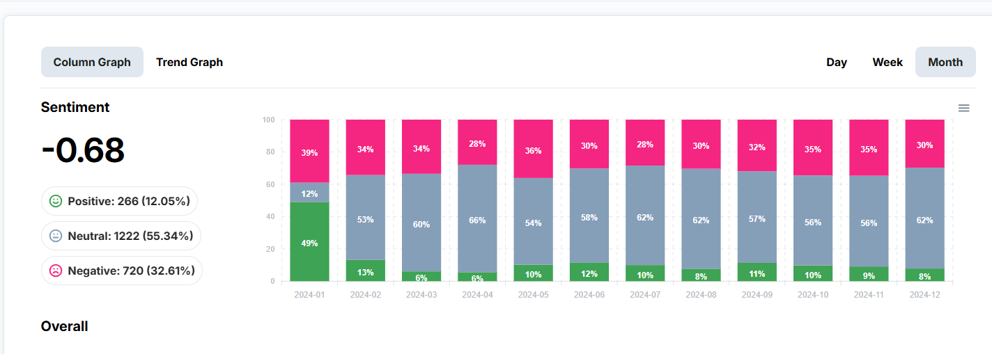
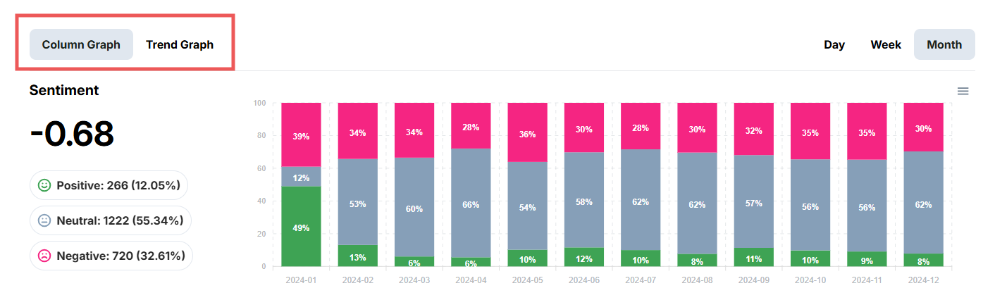
You can see a bar chart which compares the quantity of comments with positive, negative and neutral sentiment.
Use the control panel at the top right of this graph to navigate the graph.
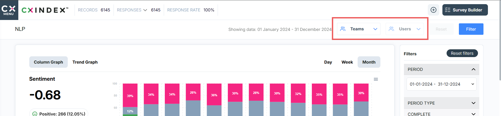
Use the filter options on the right hand side of the page to change what data you see.
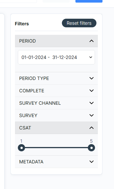
You can also filter by Teams and Users using the dropdown boxes at the right hand side of the page.
Below this is another graph that displays average sentiment score.
Click on the Day / Week / Month buttons beneath the graph to change the data periods presented.
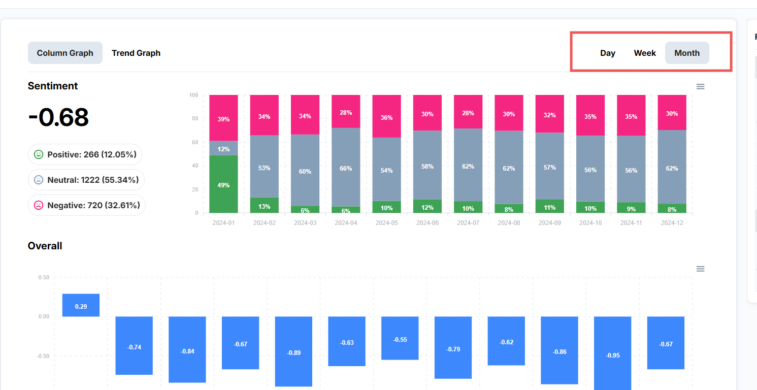
Toggle between graph types by clicking on the name of the graph displayed.
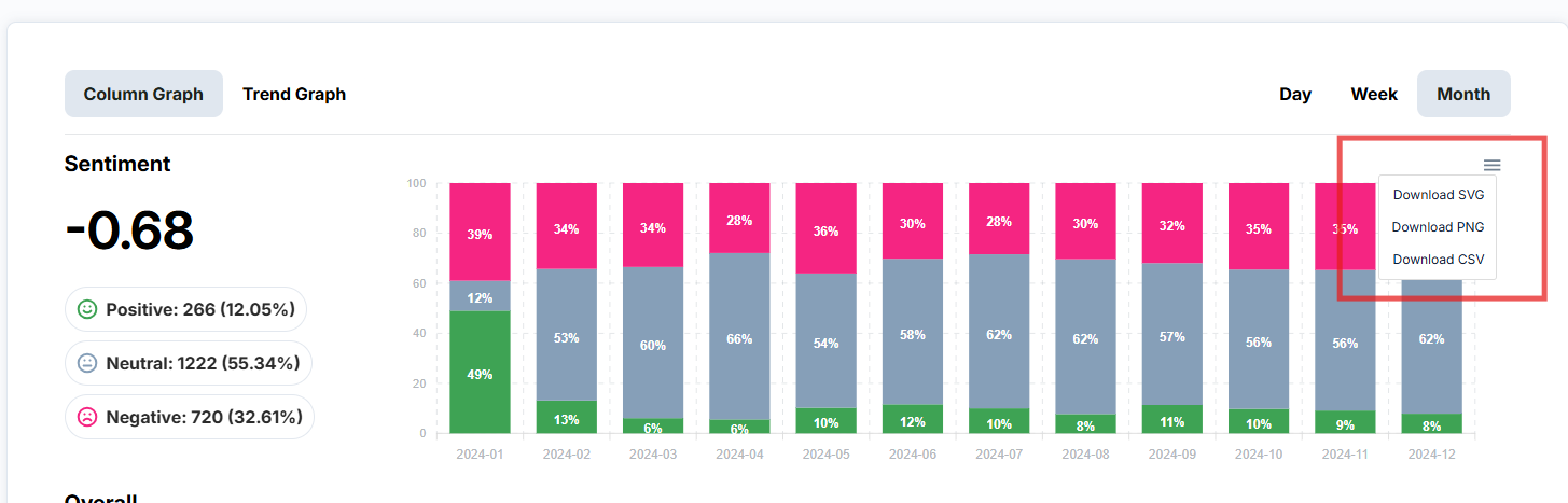
To download the graph, click on the menu icon (three lines) on the top right corner of the graph. You will see 3 options. Choose your preferred download option (SVG, PNG, CSV).
To view keywords
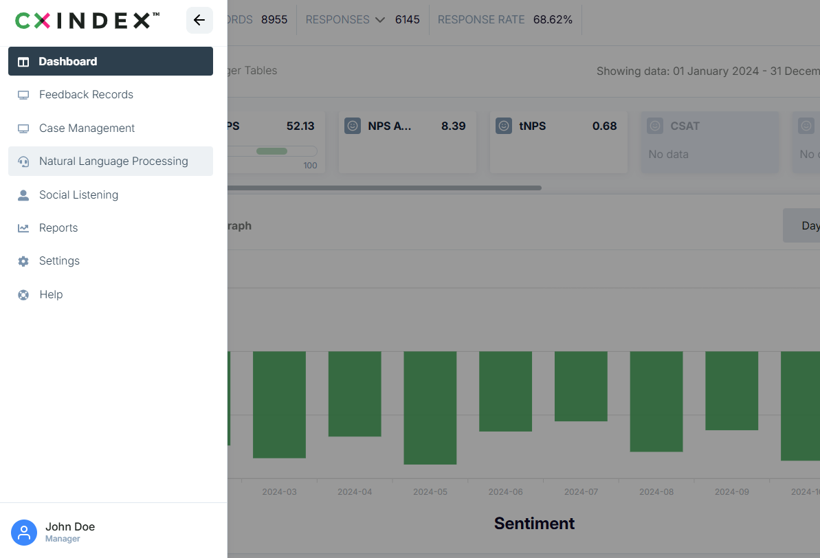
Click the menu icon on the top left corner of the home page of the app. Select Natural Language Processing.
Scroll down the page until you reach the Keywords section.
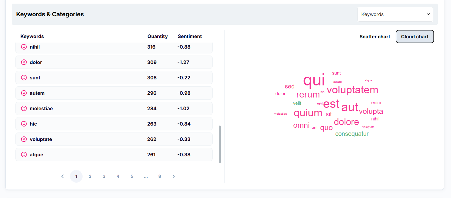
On the left hand side of the word cloud and bubble graph is a list of all keywords.
The Keyword cloud updates based on the list of Kewords currently displayed.
The colour of a keyword in the word bubble is related to its sentiment. Words in green are positive, pink are negative, and blue are neutral.
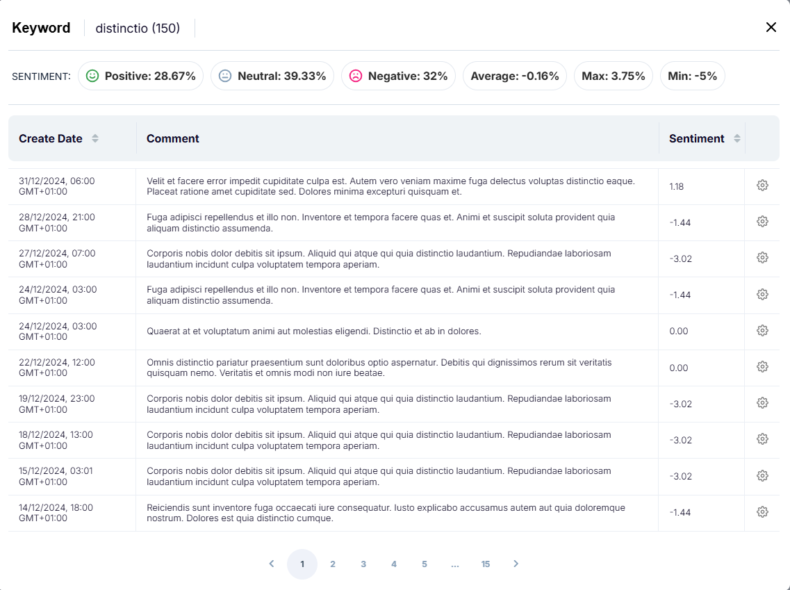
To view a specific keyword
Click on the word in the word cloud. This opens a pop-up window containing the details of this keyword.
To view comments
Scroll down the Natural Language Processing page until you reach the Comments section.
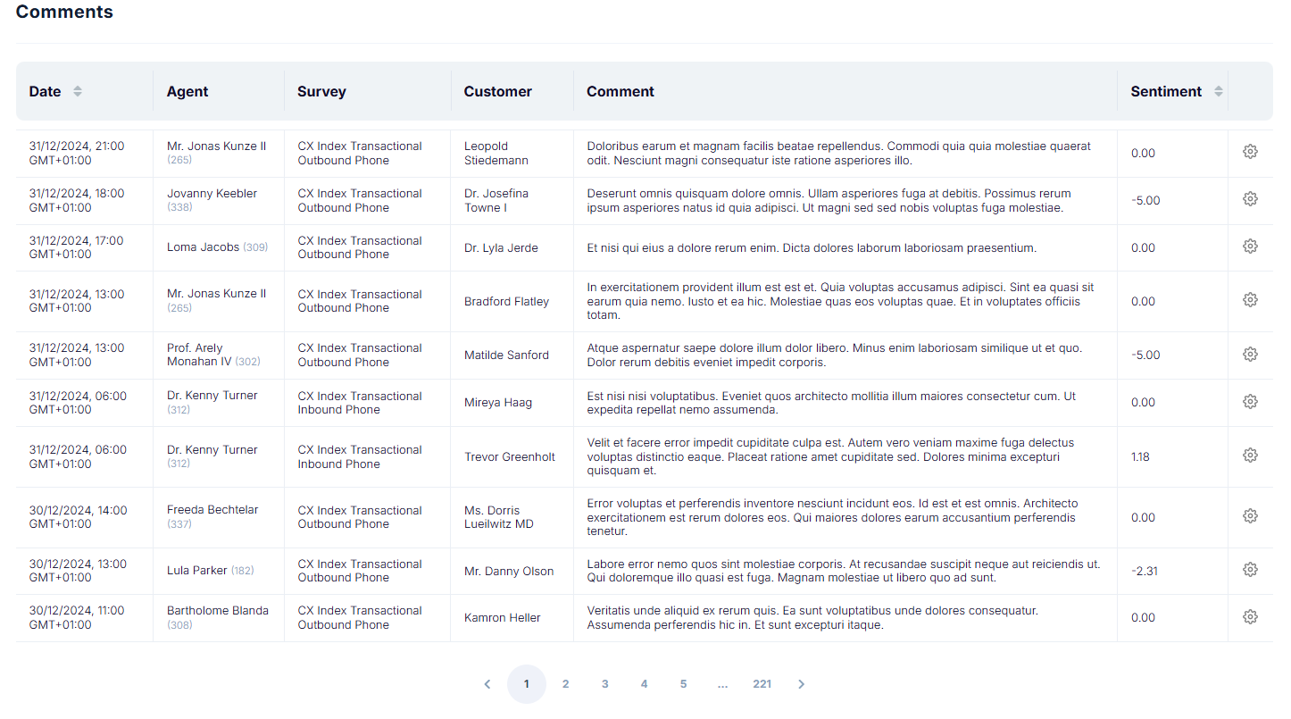
To view an individual comment, click the ellipses on the right of the record, then click Go to Feedback. This opens a pop-up window that contains the feedback details.